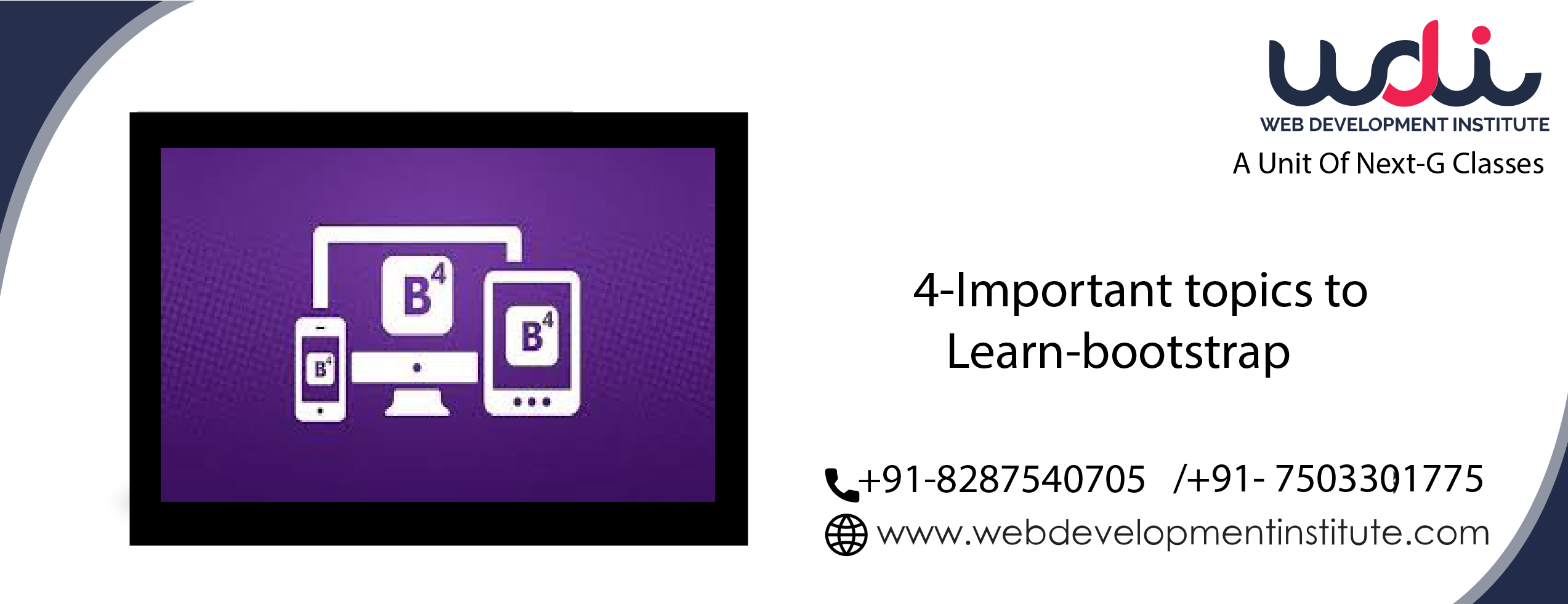
4 Important Topics to learn Bootstrap
1. Grid System: The Most Important Topic of Bootstrap is Grid; Bootstrap has a 12 Column Grid System Rule which we have to follow. It has predefined classes (col-lg-4, col-md-6, col-sm-5, col-12) for devices. Such as lg for the large device, md for the medium device, sm for a small device, etc., grid system we can easily manage boxes in all devices.
| span 1 | span 1 | span 1 | span 1 | span 1 | span 1 | span 1 | span 1 | span 1 | span 1 | span 1 | span 1 |
| span 4 | span 4 | span 4 | |||||||||
| span 4 | span 8 | ||||||||||
| span 6 | span 6 | ||||||||||
| span 12 | |||||||||||
2. Bootstrap4 Mostly Used Components and Classes :
Bootstrap4 has several useful components and classes, which helps design a web page quickly with attractive features. Such as modal box, tab panel and margins, padding classes, etc. Some of these are the following :
1. Modal Box
2. Tab panel (In Bootstrap4 Navs, Dynamic Toggleable Tabs)
3. Carousel
4. Responsive Navbar (Collapsible Navbar)
5. Bootstrap4 Card
6. Margin and Padding Classes (e.g. mt-2,mb-3,py-3)
7. Bootstrap Buttons and Alerts (handy for web application)
3. Display Utilities: Bootstrap Display utilities are helpful when hiding or showing any content in a particular device. Such as a div, we want to hide in mobile; we will use (d-none d-sm-block); here is the table for display utilities :
| Screen Size | Class |
|---|---|
| Hidden on all | .d-none |
| Hidden only on xs | .d-none .d-sm-block |
| Hidden only on sm | .d-sm-none .d-md-block |
| Hidden only on md | .d-md-none .d-lg-block |
| Hidden only on lg | .d-lg-none .d-xl-block |
| Hidden only on xl | .d-xl-none |
| Visible on all | .d-block |
| Visible only on xs | .d-block .d-sm-none |
| Visible only on sm | .d-none .d-sm-block .d-md-none |
| Visible only on md | .d-none .d-md-block .d-lg-none |
| Visible only on lg | .d-none .d-lg-block .d-xl-none |
| Visible only on xl | .d-none .d-xl-block |
4. Media Query: Media Query plays a vital role in responsive web design. It helps us to manage our designing elements in different devices. e.g. we have to manage font size in mobiles; we have to reduce margin and padding of elements etc., problems related to design.
Syntax : @media (max-width: 767px)
In above syntax we wrote 767px ,In Media query there are following size for device :
Vertical Sizes of Mobile Device
1. 320px (for iphone or 4.5 inch to 5.inch phones)
2. 360px (for galaxy s5 or 5 inch to 5.5 inch phones)
3. 414PX (for google nexus or 5.5 inch to 6 inch phones)
Horizontal Sizes of Mobile Device
1. 568px (horizontal view of iphone or 4.5 inch to 5 inch phones)
2. 640px (for galaxy s5 or 5 inch to 5.5 inch)
3. 767px (for google nexus or 5.5 inch to 6 inch)
Ipad and Ipad pro Size
1. 768px to 1024
2. 1024 to 1366px
Categories: web designing bootstrap