
CSS object-fit Property
CSS object-fit property is used to specify how your image and video will be fit into a box. Object fit property has properties to fit image or video with proper ratio without stretching it. It has the property to fit a big size image into a small box.
Object fit property is mostly used in dynamic websites to maintain image ratio, for example in an eCommerce website when a client uploads an image, he has no idea what image size should be uploaded in admin, he uploads wrong size or big size of an image, if the web designer doesn’t use object-fit property to maintain image ratio then it will create a problem in your web layout design.
So, in a dynamic website, you should use the object-fit property.
Object-fit property values:
- fill
- contain
- cover
- none
- scale-down
- initial
- inherit
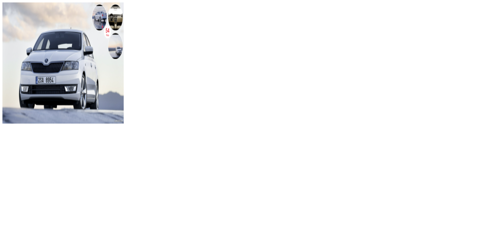
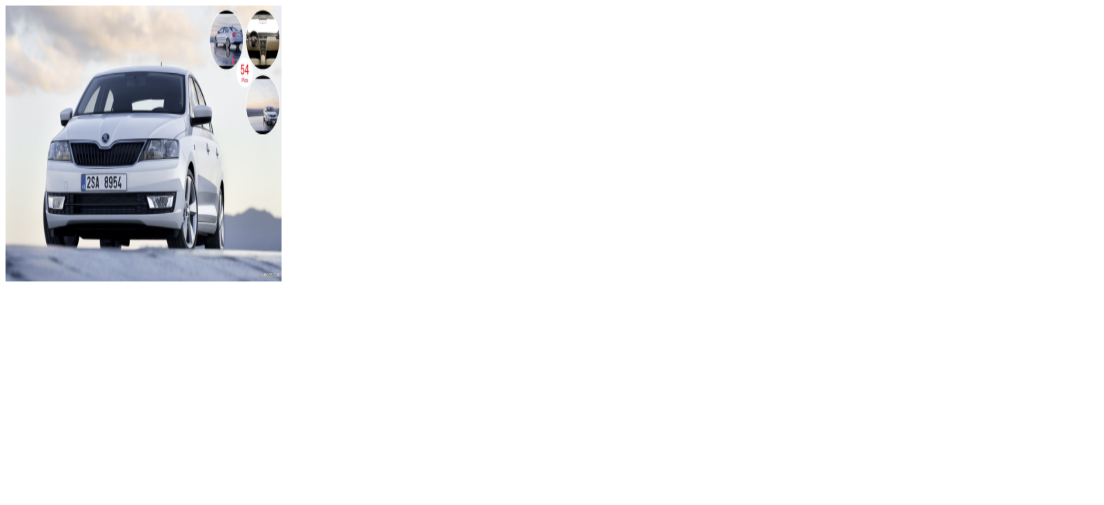
fill: It is the default value of object property. It fills the object in the container even the object is big or small, if it is bigger than the box then it squished the object, if it is smaller than the box then it will stretch the object.
Example:
<!DOCTYPE html>
<html>
<head>

<style>

.box
{
width:400px;
height:400px;
background:#eee;
}

img
{
width:400px;
height:400px;
object-fit:fill;
}
</style>

</head>

<body>

<div class="box">
<img src="car.jpg">
</div>


</body>
</html>
Output:
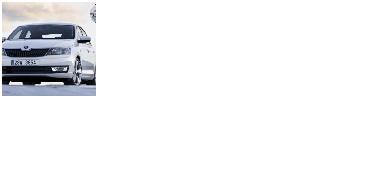
contain: It resizes the content of an element to fit into the box with an aspect ratio. If element width is more than the box then it will fit the object vertically center, if element height is more than the box then it will fit horizontally center.
Example:
<!DOCTYPE html>
<html>
<head>

<style>

.box
{
width:400px;
height:400px;
background:#eee;
}

img
{
width:400px;
height:400px;
object-fit:contain;
}
</style>

</head>

<body>

<div class="box">
<img src="car.jpg">
</div>


</body>
</html>
Output:

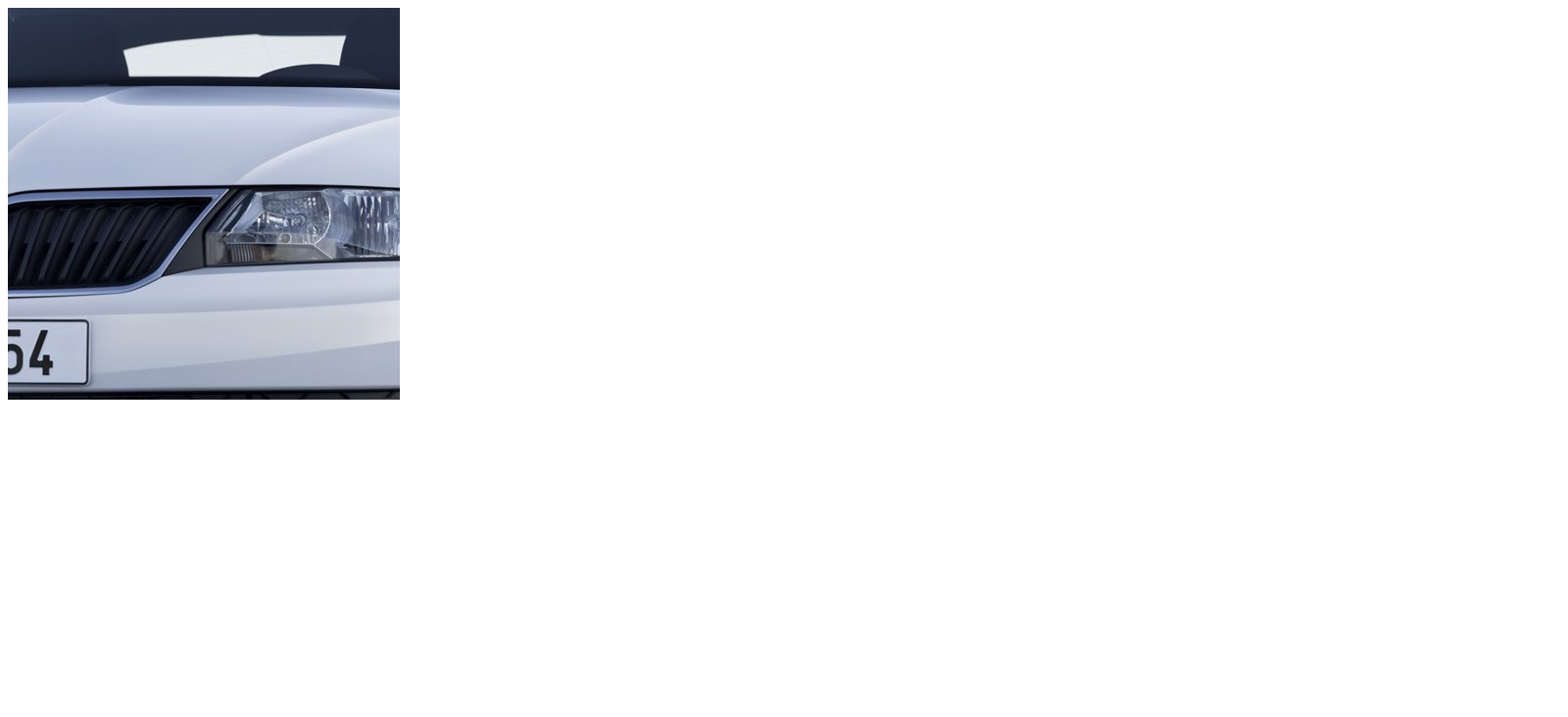
cover: It resizes the content of an element to cover its box. It crops or hides the area of an element that is not fitted into the box.
Example:
<!DOCTYPE html>
<html>
<head>

<style>

.box
{
width:400px;
height:400px;
background:#eee;
}

img
{
width:400px;
height:400px;
object-fit:cover;
}
</style>

</head>

<body>

<div class="box">
<img src="car.jpg">
</div>


</body>
</html>
Output:
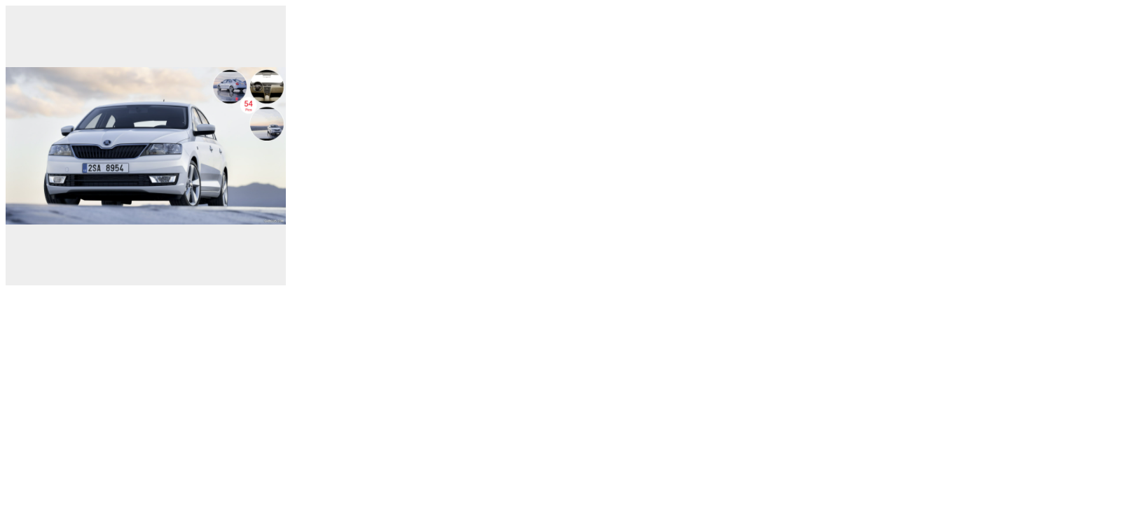
none: As its name suggests, it does not resize the element, the object will be in its original size and ignores the height and width of the box.
Example:
<!DOCTYPE html>
<html>
<head>

<style>

.box
{
width:400px;
height:400px;
background:#eee;
}

img
{
width:400px;
height:400px;
object-fit:none;
}
</style>

</head>

<body>

<div class="box">
<img src="car.jpg">
</div>


</body>
</html>
Output:
scale-down: It will use none or contain to resize the content. It results in the smallest object size.
Example:
<!DOCTYPE html>
<html>
<head>

<style>

.box
{
width:400px;
height:400px;
background:#eee;
}

img
{
width:400px;
height:400px;
object-fit:scale-down;
}
</style>

</head>

<body>

<div class="box">
<img src="car.jpg">
</div>


</body>
</html>
Output:
initial: It sets the property to the default value that is image is stretched to fit in the content because the default value is fill.
Example:
<!DOCTYPE html>
<html>
<head>

<style>

.box
{
width:400px;
height:400px;
background:#eee;
}

img
{
width:400px;
height:400px;
object-fit:initial;
}
</style>

</head>

<body>

<div class="box">
<img src="car.jpg">
</div>


</body>
</html>
Output:
inherit: It receives the value from its parent element.
Example:
<!DOCTYPE html>
<html>
<head>

<style>

.box
{
width:400px;
height:400px;
background:#eee;
object-fit:cover;
}

img
{
width:400px;
height:400px;
object-fit:inherit;
}
</style>

</head>

<body>

<div class="box">
<img src="car.jpg">
</div>


</body>
</html>
Output:

Categories: web designing css